
Victims

Hide and Seek

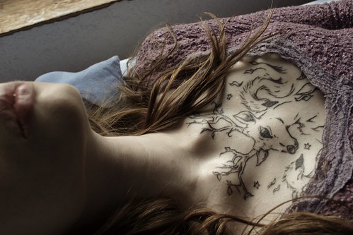
Innocence Part 2


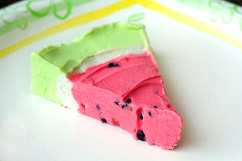 The only thing better than watermelon? A colourful slice of Watermelon pie. Fun summer dessert indeed!
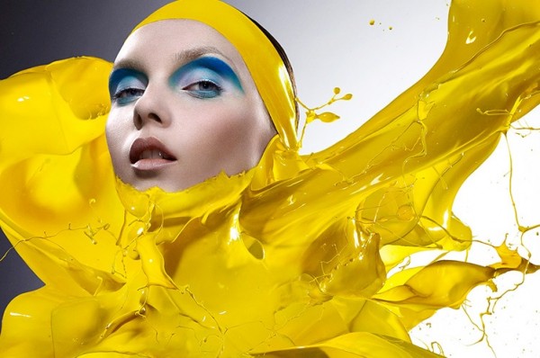
 Innovative beauty photography by Iain Crawford featuring every hue imaginable, courtesy of TrendLand.

 This poptastic Massachusetts apartment (thanks, Apartment Therapy) is so rad. Especially loving the plush red chair and wall of Pez!


 Joachim Froese, The Temptation of Adam and Eve, 2005, 4 Silver Gelatin Prints
 Rhopography 8, 1999, 4 Silver Gelatin Prints
 Rhopography 15, 2000, 3 Silver Gelatin Prints
 Rhopography 18, 2001, 4 Silver Gelatin Prints
 Juan Sanchez Cotan, Coing, Chou, Melon et Concombre
 Rhopography 27, 2002, 3 Silver Gelatin Prints
 Rhopography 40, 2003, 3 Silver Gelatin Prints
 Rhopography 41, 2003, 3 Silver Gelatin Prints
 Portrait of my Mother (detail), 2006, 3 archival inkjet prints
 Portrait of my Mother (detail), 2006, 3 archival inkjet prints
 Portrait of my Mother (detail), 2006, 3 archival inkjet prints
"I photographed at night and during the day assembled the pictures on the computer at her bedside as she wanted me to continue with 'our' project until her last moment. After her death I finished the series until all her books were photographed in 'her' order."The devastation of losing those we love is something we all have to deal with during our lives, and I think that Joachim's Portrait is made all the more poignant by the fact that his work is about a celebration of his mother's life, created even as that life faded away.
 Written in the Past 1, 2007, 3 archival pigment inkjet prints
 Written in the Past 8, 2007, 3 archival pigment inkjet prints
 Written in the Past 9, 2007, 3 archival pigment inkjet prints
 Written in the Past 10, 2007, 3 archival pigment inkjet prints