
Showing posts with label photography. Show all posts
Showing posts with label photography. Show all posts
October 5, 2009
Educate Yo'Self!
"F. Scott Fitzgerald once wrote, 'hot chicks are not like you and me'". Check out the latest Target Women with Sarah Haskins - Current TV
I have had my daily dose of money envy after looking at these photos of the Paraty Houe - Contemporist via Apartment Therapy
Check out these photos of Hemingway's beautiful home. I especially love the exterior shot - Lost by Vic
Roller Derby is one of my favourite things in life, so I was a little apprehensive about Drew Barrymore (of all people) directing a movie about it. Turns out it's not that bad, and maybe even a little sweet... phew? - Salon
As someone who lived pay to pay for years, I can say with confidence that being poor is not fun, and those fetishizing financial struggle because their investments took a hit last year can go shove it - Jezebel
John Lee Anderson discusses his latest piece on the gangs in the favelas of Rio de Janeiro in this affecting audio slideshow - The New Yorker


September 25, 2009
Miranda July is Super Cool and We Should be Friends
I really like Miranda July. She reminds me of a friend of mine from uni, Ria. They are both just super cool, without trying to be, and without affectation. And I always realise how uncool I am when I compare myself with either of them and their achievements. I would hate them for this, except Miranda July seems really sweet, and I know Ria is, so instead I feel happily envious for them and a little sad for me.
The below images come from a Vice magazine story where July posed as background extras from classic movies like Grease. This series is classic, quirky July and I love it.


However out of all of them, I think this last pair is my favourite. The image of July moves past the recreation hook and is a beautiful, haunting image in its own right.


The below images come from a Vice magazine story where July posed as background extras from classic movies like Grease. This series is classic, quirky July and I love it.


September 23, 2009
Brisbane Dust Storm

Courtesy of the dust storm Eugenie alluded to in the previous post, everything in our house is now finely coated in powdery red dust. Thanks years long drought!
I was out and about during the worst of it and wow, it was amazing, it came on so quickly. I'm really enjoying a photo set Quest Newspapers have posted of the Wynnum seaside. The sepia tint of the dust goes really well with the general nostalgic dagginess that is Wynnum. These photos brought back lots of memories - when we were kids our family used to go there for fish and chips and rollerskating. I haven't been there for a long time, but by the looks of these photos, nothing much has changed since I was a little girl.


Summer of Colour!
As dust storms paint the entire city an ugly shade of rust, I'm going to take it upon myself to brighten things up with a cornucopia of colour! So, to start things off...
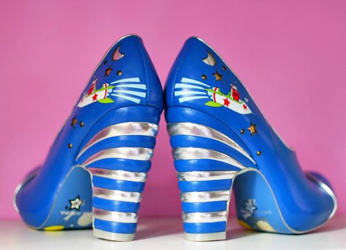
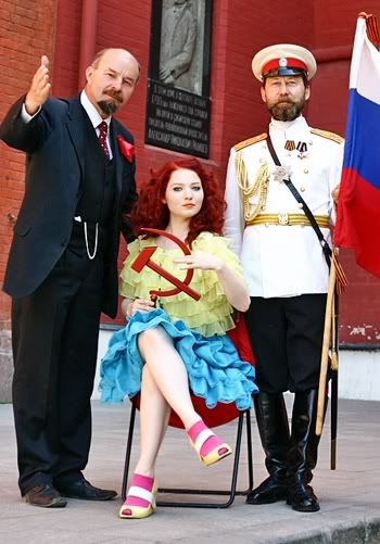
Shoes! Irregular Choice is responsible for some rather, uh "quirky" creations, but these are hands-down bitchin'. I'm a sucker for anything retro-space-age and these are no exception. I found these via makeup mogul Doe Deere's blog, which is worth a look if you enjoy feeling pangs of envy. In all honesty though, Ms Deere is a sweet slip of a gal who can rock pretty much any colour combination with her flaming red hair. Behold:
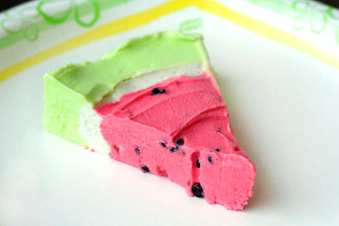 The only thing better than watermelon? A colourful slice of Watermelon pie. Fun summer dessert indeed!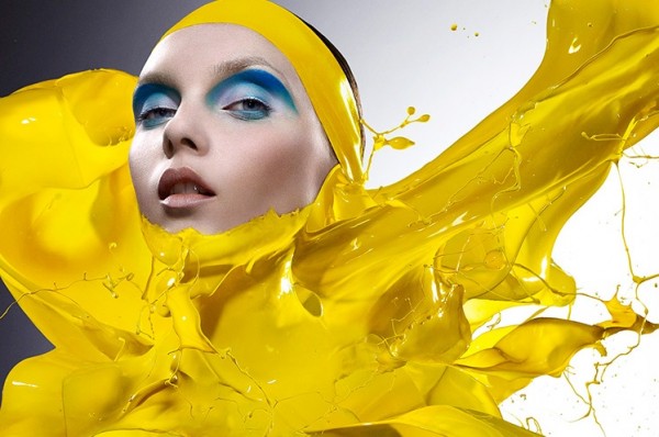
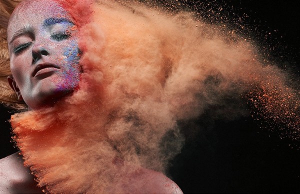 Innovative beauty photography by Iain Crawford featuring every hue imaginable, courtesy of TrendLand.

 This poptastic Massachusetts apartment (thanks, Apartment Therapy) is so rad. Especially loving the plush red chair and wall of Pez!


This restaurant fitout for Mezzoart Cafe by Prv Commissions is officially amazing. The decals, the screaming colour, the Louis chairs... perfect.


Dear Yayoi Kusama:
You are magical.
Sincerely, me.
And as a final colour explosion, I shall leave you with this video from the Horrors. Enjoy!
April 5, 2009
Joachim Froese
A bit about me, so this post makes sense: I am currently completing the third, and what should be (but won't be) final year of my photography degree at the Queensland College of Art. This is the year where I produce my final folio, spend hours in the dark room and also cry a bit. That seems to be the trend after five weeks back anyway.
Just like all the departments at QCA, the Photography Department has many up-and-coming and established and well renowned photographers tutoring and lecturing in their ranks, including Joachim Froese, Ray Cook, Paul Adair, Marian Drew and Nathan Corum, to name but a few. It can be easy to take them for granted and just view them as lecturers, or maybe even friends.
I was visiting a friend of mine's place the other day (which should really be described as an art gallery with some beds and a kitchen - amazing) and I saw this piece from Joachim Froese's Species series hanging on the wall:
 Joachim Froese, The Temptation of Adam and Eve, 2005, 4 Silver Gelatin Prints
I am a little ashamed to say that, although there have been exhibitions I should have attended, this was the first time I had seen one of Joachim's works in person, true to scale - real - instead of recreated on a computer screen. And despite what those anti-almost-everything fuckers over on the right may say (whispers of elitism, etc) seeing an artwork in person is important, is special. There will always be a loss of detail in reproductions, and significant aspects of the work which influence your reaction to/relationship with the work, such as texture, size and scale, are often lost.
Elitist rant aside, standing in front of this piece of art made me think about how much I love Joachim's work - it's beautiful and accessible, but so much meaning and history can be found underneath the surface.
Joachim Froese has been my tutor for a few subjects during my time at the Queensland College of Art. As a tutor, he is strict but fair, incredibly knowledgeable and passionate about his discipline, encouraging of discussion and dissent against his views, and able to give constructive criticism that in no way lets you off lightly, but doesn't leave you feeling crushed and defeated either (which I recently experienced).
As a photographer, I really admire him and his work. Joachim grew up in Germany, and is particularly interested in and influenced by the Dutch and Spanish still life traditions. His works often references or even adopts traditional painting tropes. His unique style carries throughout his life's work, yet his works are never 'samey'. Technically, his work is also very strong - I can only hope to one day have such control over my images - and I really like that in art photographers. I don't really have much interest in those whose technical sloppiness is excused away as artistic intent, when really it's a lot more likely due to lack of control, laziness or an attempt to cash in on the latest cool photography craze.
Probably the most distinctive feature of Joachim's work is the creation of one image using multiple panels/prints. I originally assumed that this was done by shooting one frame, then chopping it up during editing, but each separate panel is an individual image, set up and lit so your eye will travel smoothly from one panel to the next. This allows him to play lots of lovely tricks with repetition, symmetry and fragmentation. The first body of work where he used this panelling technique was Rhopography 1999 - 2001.
 Rhopography 8, 1999, 4 Silver Gelatin Prints
 Rhopography 15, 2000, 3 Silver Gelatin Prints
 Rhopography 18, 2001, 4 Silver Gelatin Prints
Fun Fact: Joachim only uses insects that have died of natural causes. He then pulls all their legs, wings and other attachment off and glues them back together exactly the way he needs them to be for his shot. So you are actually seeing the same bee twice in Rhopography 18, just repositioned after being pulled apart and put back together again.
Where the first Rhopography series focused on dead insects and referenced the Dutch still life tradition, Rhopography 2002 - 2003 draws from Spanish still life, in particular, monk and painter Juan Sanchez Cotan's exploration of geometry and symmetry in his images of fruit and vegetables in the cool house.
 Juan Sanchez Cotan, Coing, Chou, Melon et Concombre
 Rhopography 27, 2002, 3 Silver Gelatin Prints
 Rhopography 40, 2003, 3 Silver Gelatin Prints
 Rhopography 41, 2003, 3 Silver Gelatin Prints
 Portrait of my Mother (detail), 2006, 3 archival inkjet prints
 Portrait of my Mother (detail), 2006, 3 archival inkjet prints
 Portrait of my Mother (detail), 2006, 3 archival inkjet prints
The work was a collaborative effort between Joachim and his mother:
Joachim continued his exploration of memory and loss in his most recent work Written in the Past (2007). Each object depicted in the series is linked to his past - to Joachim, the images are explicit, like a diary entry. To those of us not privy to his memory, we are given this one clue and then left to interpret for ourselves.
 Written in the Past 1, 2007, 3 archival pigment inkjet prints
 Written in the Past 8, 2007, 3 archival pigment inkjet prints
 Written in the Past 9, 2007, 3 archival pigment inkjet prints
 Written in the Past 10, 2007, 3 archival pigment inkjet prints
Joachim's work is held in the public collections of the National Gallery of Australia, QUT Art Museum Brisbane and the Queensland Art Gallery, among others. His work has been featured and reviewed in such respected art publications as PhotoFile, PhotoNews and Eyeline.
Just like all the departments at QCA, the Photography Department has many up-and-coming and established and well renowned photographers tutoring and lecturing in their ranks, including Joachim Froese, Ray Cook, Paul Adair, Marian Drew and Nathan Corum, to name but a few. It can be easy to take them for granted and just view them as lecturers, or maybe even friends.
I was visiting a friend of mine's place the other day (which should really be described as an art gallery with some beds and a kitchen - amazing) and I saw this piece from Joachim Froese's Species series hanging on the wall:
 Joachim Froese, The Temptation of Adam and Eve, 2005, 4 Silver Gelatin Prints
I am a little ashamed to say that, although there have been exhibitions I should have attended, this was the first time I had seen one of Joachim's works in person, true to scale - real - instead of recreated on a computer screen. And despite what those anti-almost-everything fuckers over on the right may say (whispers of elitism, etc) seeing an artwork in person is important, is special. There will always be a loss of detail in reproductions, and significant aspects of the work which influence your reaction to/relationship with the work, such as texture, size and scale, are often lost.
Elitist rant aside, standing in front of this piece of art made me think about how much I love Joachim's work - it's beautiful and accessible, but so much meaning and history can be found underneath the surface.
Joachim Froese has been my tutor for a few subjects during my time at the Queensland College of Art. As a tutor, he is strict but fair, incredibly knowledgeable and passionate about his discipline, encouraging of discussion and dissent against his views, and able to give constructive criticism that in no way lets you off lightly, but doesn't leave you feeling crushed and defeated either (which I recently experienced).
As a photographer, I really admire him and his work. Joachim grew up in Germany, and is particularly interested in and influenced by the Dutch and Spanish still life traditions. His works often references or even adopts traditional painting tropes. His unique style carries throughout his life's work, yet his works are never 'samey'. Technically, his work is also very strong - I can only hope to one day have such control over my images - and I really like that in art photographers. I don't really have much interest in those whose technical sloppiness is excused away as artistic intent, when really it's a lot more likely due to lack of control, laziness or an attempt to cash in on the latest cool photography craze.
Probably the most distinctive feature of Joachim's work is the creation of one image using multiple panels/prints. I originally assumed that this was done by shooting one frame, then chopping it up during editing, but each separate panel is an individual image, set up and lit so your eye will travel smoothly from one panel to the next. This allows him to play lots of lovely tricks with repetition, symmetry and fragmentation. The first body of work where he used this panelling technique was Rhopography 1999 - 2001.
 Rhopography 8, 1999, 4 Silver Gelatin Prints
 Rhopography 15, 2000, 3 Silver Gelatin Prints
 Rhopography 18, 2001, 4 Silver Gelatin Prints
Fun Fact: Joachim only uses insects that have died of natural causes. He then pulls all their legs, wings and other attachment off and glues them back together exactly the way he needs them to be for his shot. So you are actually seeing the same bee twice in Rhopography 18, just repositioned after being pulled apart and put back together again.
Where the first Rhopography series focused on dead insects and referenced the Dutch still life tradition, Rhopography 2002 - 2003 draws from Spanish still life, in particular, monk and painter Juan Sanchez Cotan's exploration of geometry and symmetry in his images of fruit and vegetables in the cool house.
 Juan Sanchez Cotan, Coing, Chou, Melon et Concombre
 Rhopography 27, 2002, 3 Silver Gelatin Prints
 Rhopography 40, 2003, 3 Silver Gelatin Prints
 Rhopography 41, 2003, 3 Silver Gelatin Prints
After Species, Joachim's next work - and his first captured with a digital camera and in colour - was Portrait of My Mother in 2006, photographed during the last weeks of his mother's life.
 Portrait of my Mother (detail), 2006, 3 archival inkjet prints
 Portrait of my Mother (detail), 2006, 3 archival inkjet prints
 Portrait of my Mother (detail), 2006, 3 archival inkjet prints
The work was a collaborative effort between Joachim and his mother:
"I photographed at night and during the day assembled the pictures on the computer at her bedside as she wanted me to continue with 'our' project until her last moment. After her death I finished the series until all her books were photographed in 'her' order."The devastation of losing those we love is something we all have to deal with during our lives, and I think that Joachim's Portrait is made all the more poignant by the fact that his work is about a celebration of his mother's life, created even as that life faded away.
Joachim continued his exploration of memory and loss in his most recent work Written in the Past (2007). Each object depicted in the series is linked to his past - to Joachim, the images are explicit, like a diary entry. To those of us not privy to his memory, we are given this one clue and then left to interpret for ourselves.
 Written in the Past 1, 2007, 3 archival pigment inkjet prints
 Written in the Past 8, 2007, 3 archival pigment inkjet prints
 Written in the Past 9, 2007, 3 archival pigment inkjet prints
 Written in the Past 10, 2007, 3 archival pigment inkjet prints
Joachim's work is held in the public collections of the National Gallery of Australia, QUT Art Museum Brisbane and the Queensland Art Gallery, among others. His work has been featured and reviewed in such respected art publications as PhotoFile, PhotoNews and Eyeline.
Subscribe to:
Posts (Atom)
